Weather Underground Redesigned

Background
Weather Underground is a destination for finding information on all things weather-related news on weather-related events, the local weather information, a forecast for an upcoming trip, etc. When we took the first look at the website, the outdated website design and all the ads surrounding the information represented a bad experience for users to check the weather. Our mission is to use UX research methods to conduct a redesign solution to bring a whole new life.
Role
Our redesigned website will improve the usability of different kinds of weather-related features and brand awareness. As a team leader, we had five group meetings and determined that the current features will be optimized in a better interactive interface for newer desktop devices to easy to browse information and explore details. I also made decisions on the barely noticeable functions that we are going to enhance to give users more additional discoverability to use them.
Business Goal
Reusing most of the website's current features to rearrange them into a new and modern look.
Carrying a widget-like experience for users to simply navigate information and the company can still show its advertisements.
Combining with our use of usability test analysis to introduce useful and accessible weather-related features to current and new customers.
Research
Understand the current users’ common needs regarding the weather information and any other information that connects with the weather.
Find the solutions of how to unveil a great design of a weather website on desktops and laptops.
Unearth the pain points of using the weather providers’ websites.
Recognize both positive and negative design principles of the web pages’ flows.
Research Goal
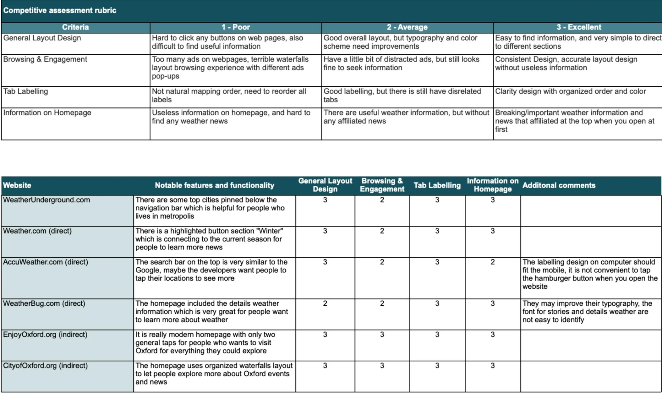
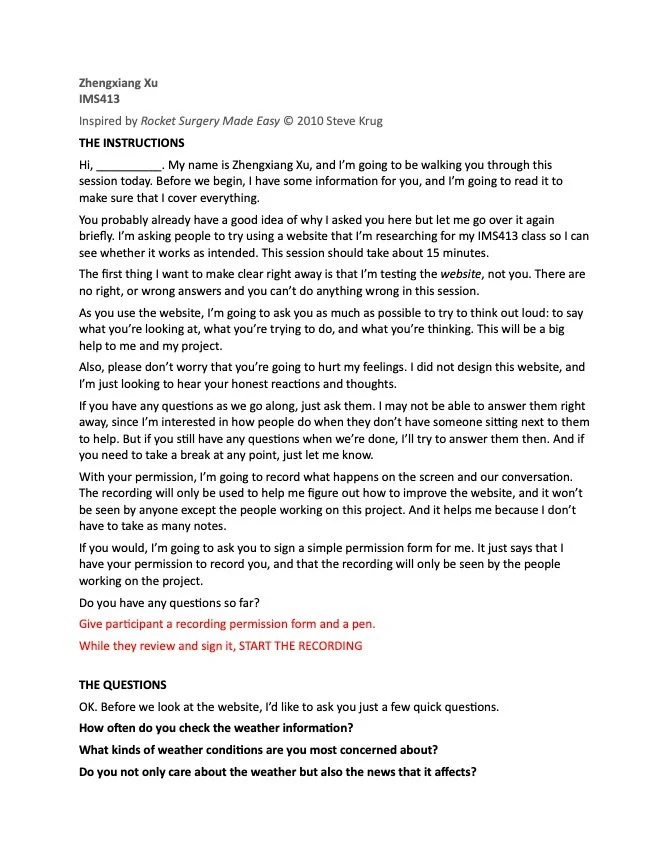
Our research is partly focusing on comparing multiple weather information competitors including direct and indirect websites. We generally created a competitive assessment rubric for scoring the competitors’ websites and highlighting their strengths and weaknesses to conduct what kinds of information we may need to present to customers on desktops. We randomly picked three users who often use weather-related tools to perform interviews through Zoom calls. The questions we generated are based on the comparative analysis and we take notes while they are answering.
Research Method
All types of questions we created are connected to the common tasks on weather websites and the first impressions when users are landing on the homepage. There are three main question sections: background, detailed, and follow-up questions. The background questions let users point out their using habits and frequency on weather websites and applications. Detailed questions invite users to do the website tour and tasks on the specific website, and get comments and feedback on their feelings. The follow-up questions are focusing on the answers to two previous questions we asked to add more small questions.
Questions

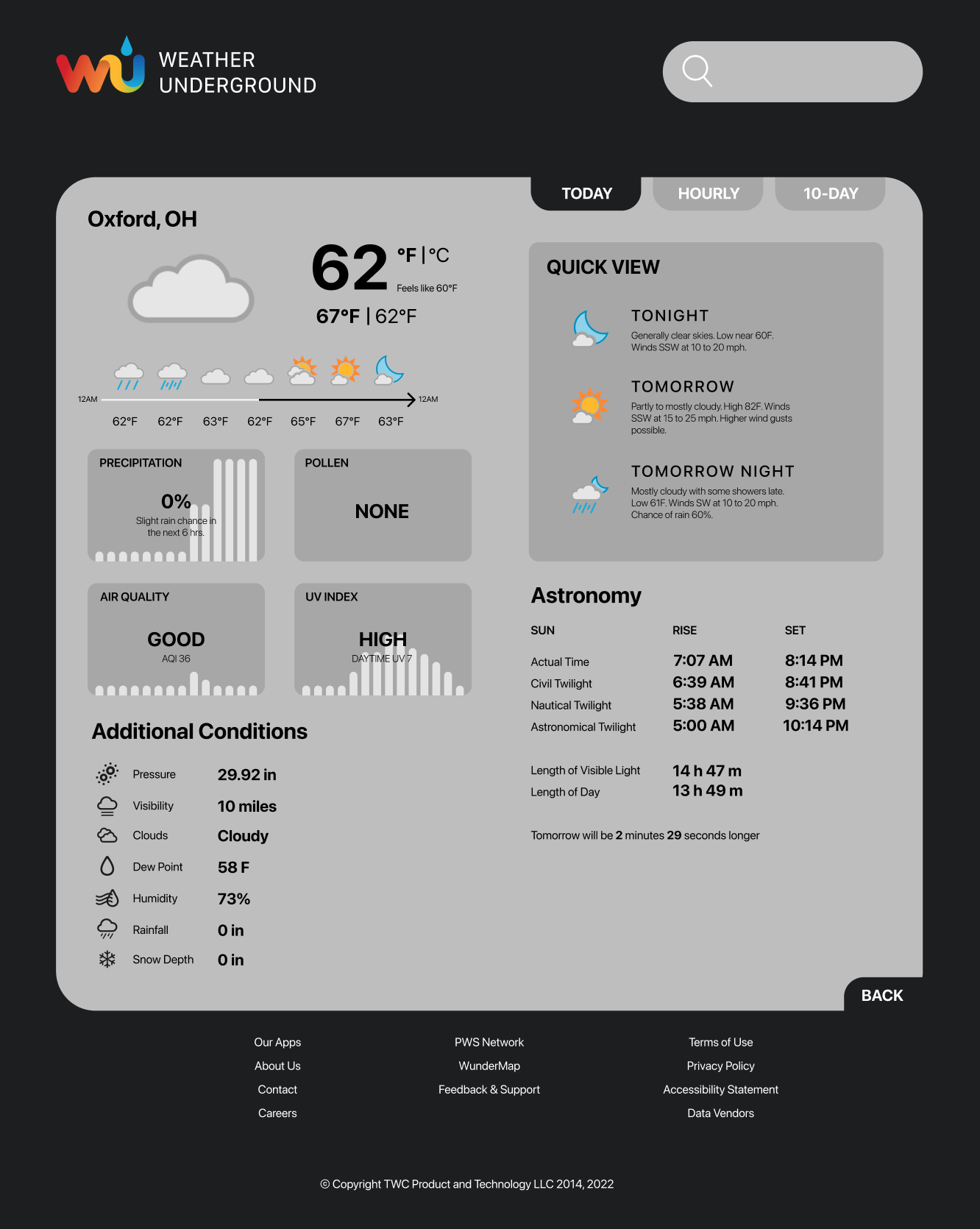
Most of the competitors’ websites are not clean and consistent which means including different kinds of weather data. Our redesigned website which is the Weather Underground is in dark mode style, when testers clicked on other pages of the website, it is not dark mode. Sudden transitions make the eyes especially uncomfortable. It also has a wealth of weather data. Not just limited to the weather. There are even details about astronomy. The alternative information sometimes could attract some people to click to check.
Research Findings
People Problem
People are generally only interested in weather conditions rather than insignificant news. Unless there is a severe weather disaster, their thought is necessary to highlight it on the homepage. Also, people think the weather map is one of the most effective features of the weather website. Many users will be immersed in viewing the weather changes here, but there are advertisements that means ads cannot be displayed on the full screen which greatly reduces the experience here.
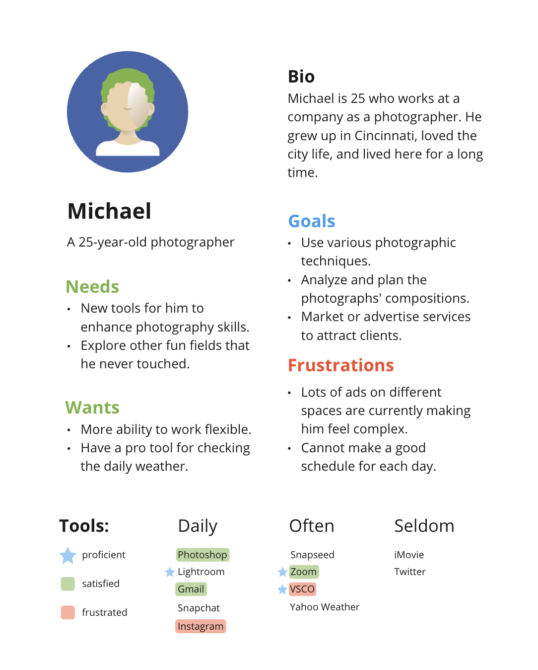
Persona


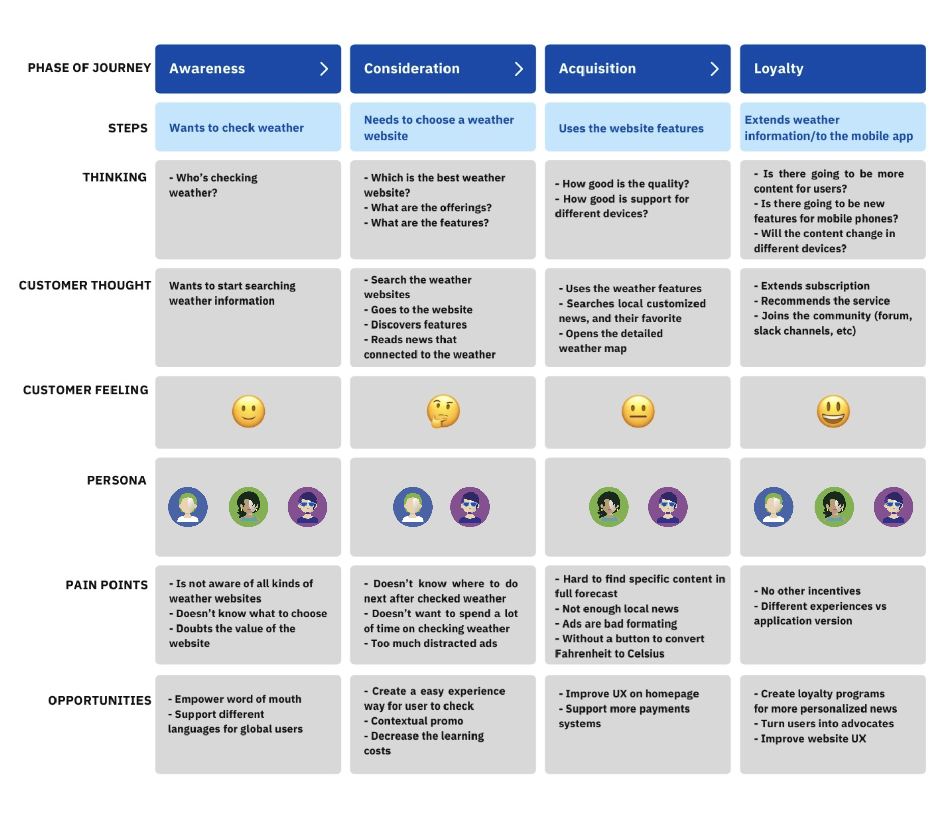
Journey Map
Workflow

Before
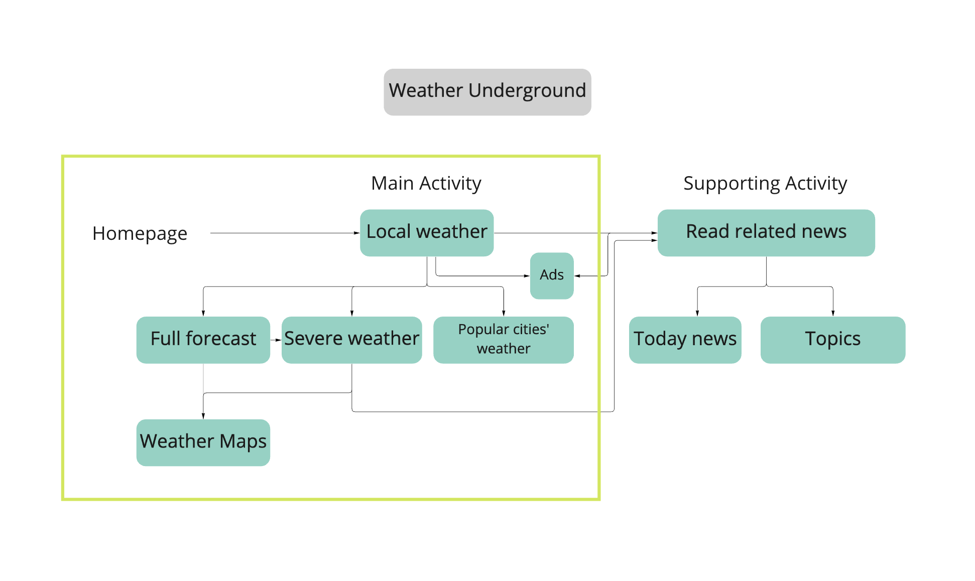
After
IA

Sitemap

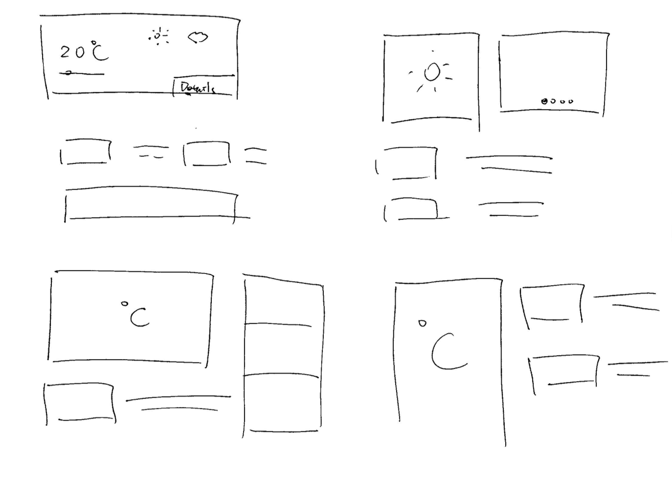
Sketches

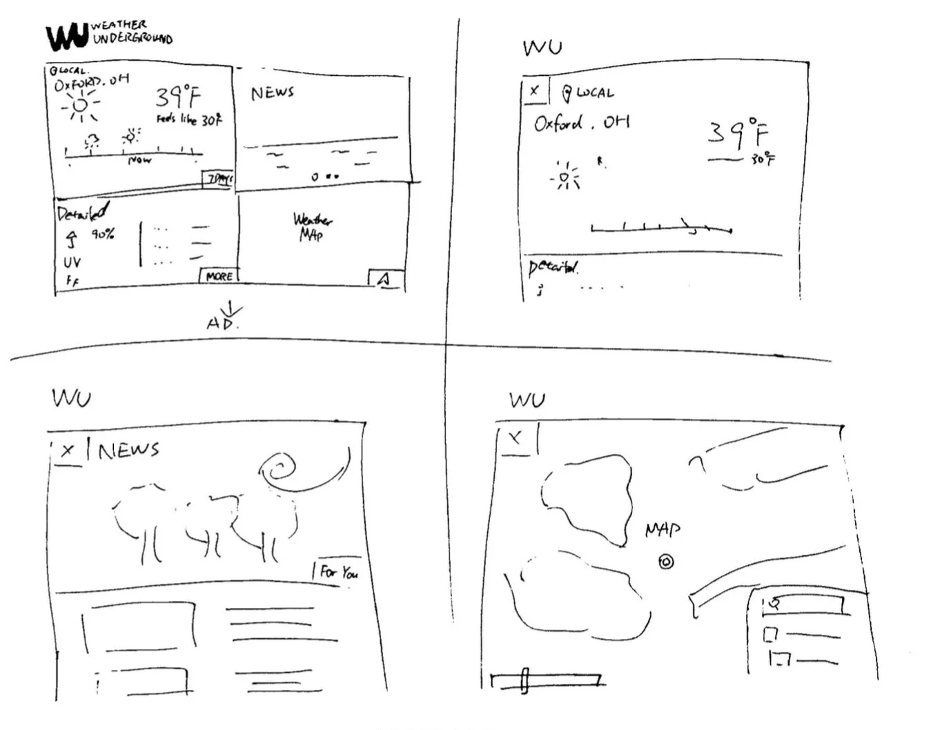
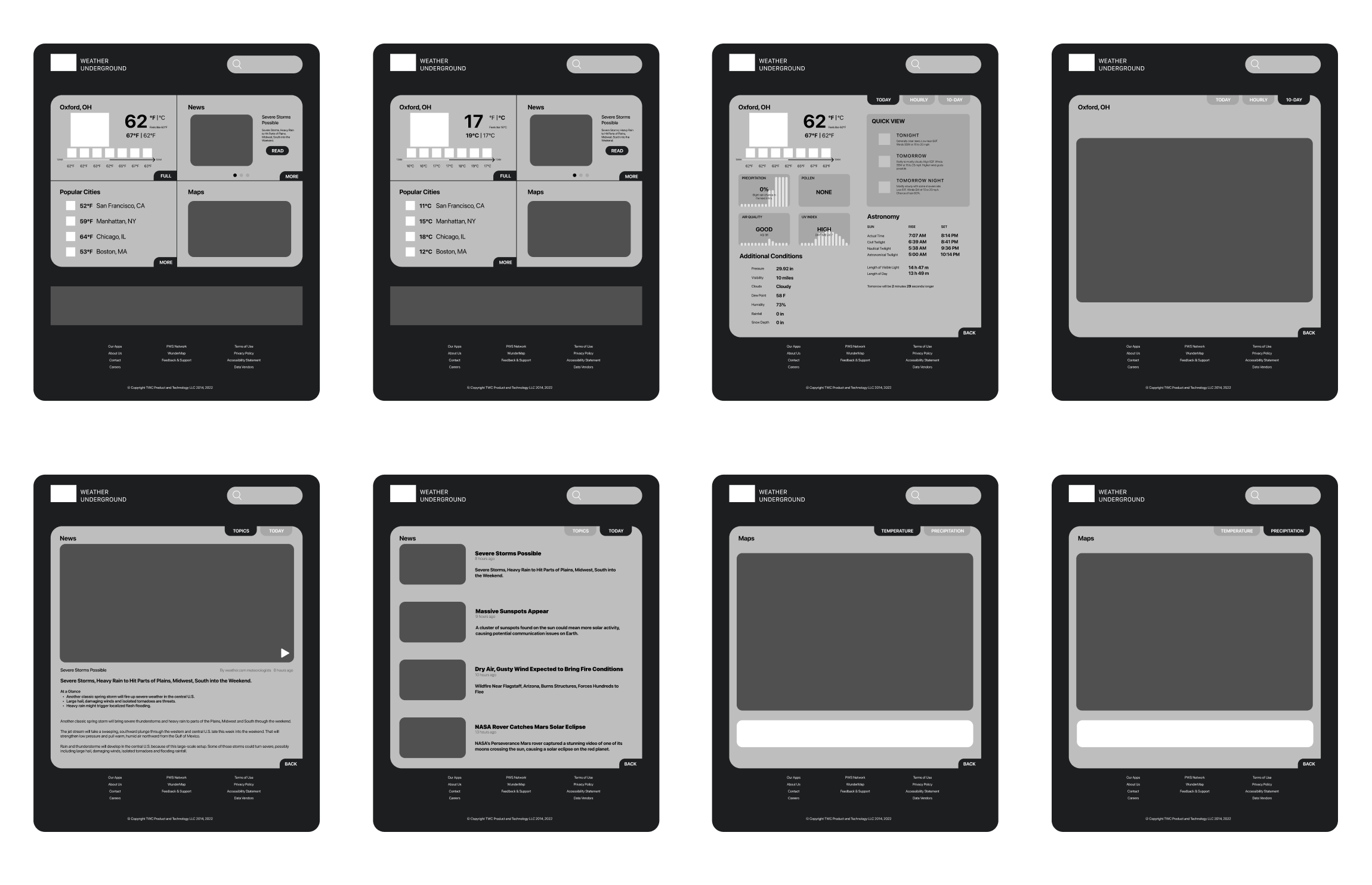
Wireframes
Final Mockups