
311Cincy app Redesigned
Background
The project is focusing on a service that is part of the overall 311Cincy Customer Service initiative which is giving citizens a 24/7 connection to City services through the mobile app. To understand the whole service experience and design, I conducted several user interviews with local Cincinnati citizens, created user journey maps, and did research on online reviews to see how the services work and the improvements they need to consider in.
Persona and Journey Maps


Analysis
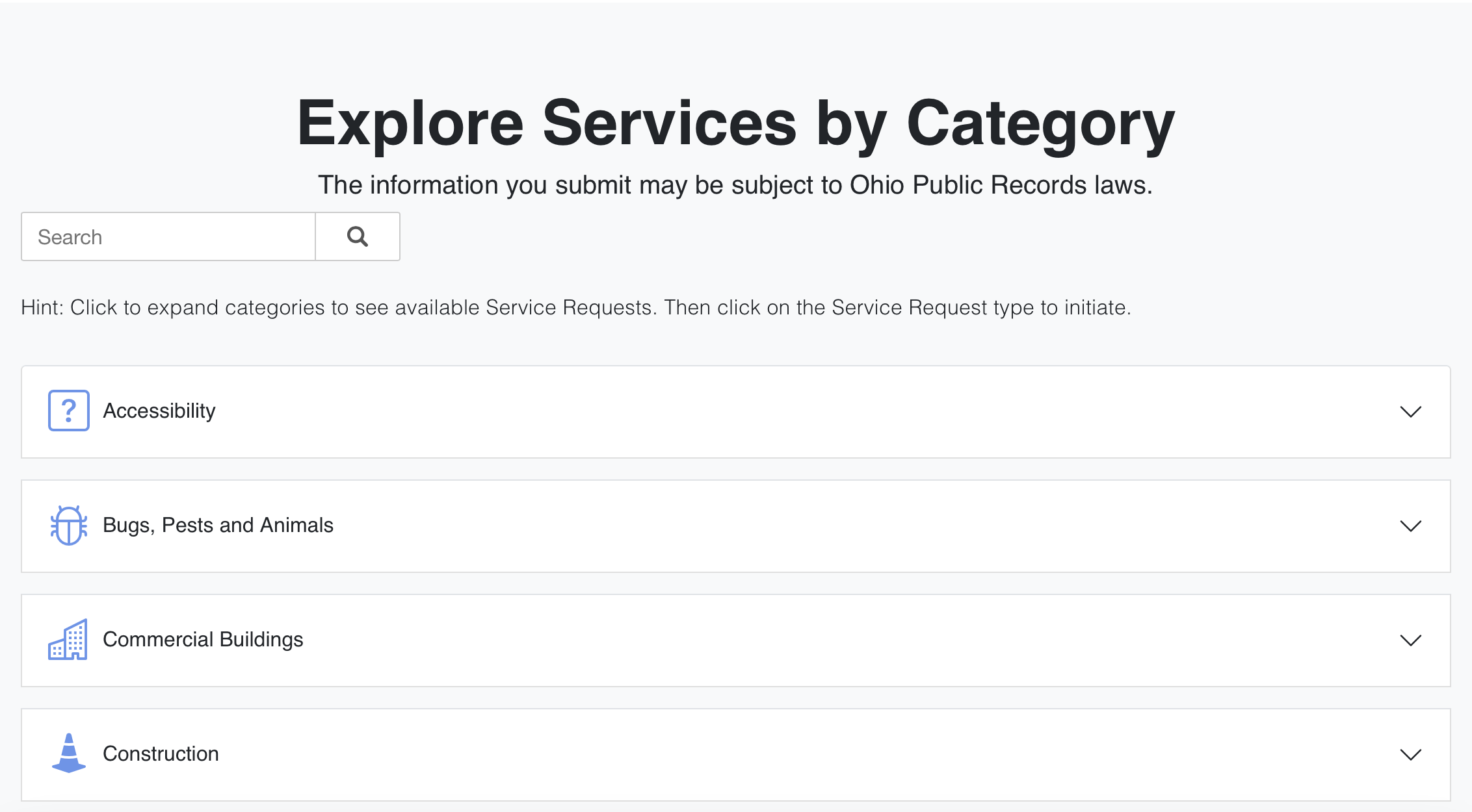
The service website provides four essential ways to request services. After seeing the four main categories, you may have your own ability to use keywords to search for services and search for the existing services that you requested before. The “Frequently Used Service Requests” highlight that most people living in the Cincinnati area used services to match what they might want to ask. The bottom section which is “Explore Services by Category” is very helpful for inspiring people who need ideas to start their requests. Each category has an icon nearby to make their information for users to easily understand.
Service Strengths
The app looks like no longer updated to the newest design languages. The app works okay and is functional but the design and workflows could be hard to feel and get feedback when users actually request a service. The first step for a service request is to find the location where you want to request, and the maps and steps to type location are pretty old which is not good for accessibility and usability. The sidebar menu also does not fit the iOS Human Interface Guidelines which is too Android-like. For real-time engagement, there is no section on both the website or mobile app that shows the scheduled renovations or constructions, and outage information that is related to the citizen’s life. However, they do have an official Twitter account that is not actively posting news about what is happening in the Cincinnati area. The tweets are the most retweets from each different categories make the account looks like an advertising tool.
Room for Improvements
In the aspect of the regulation, the communication issues between the city and the third-party provider are the obstacles. When the users who are the city government need to do some changes and updates, they need to send information to the provider to discuss if the idea could be achieved or not. If there is a bias, it might be harder for the city government to make the system more accessible and better for citizens to use.
Factors Might Limit Design


Problem Statement
Adult residents of the Cincinnati metropolitan area need a simpler way to receive announcements and news about the city because it is too inconvenient to learn what is currently happening on multiple social media accounts.
Design Process
Review the Existing app
I decided to deeply review the 311Cincy app on the iOS platform which is one of the most popular platforms they currently use. The two parts I mainly focus on are the user interface and the flows while the user is requesting a service. For the user interface, I always ask myself two questions: is it already fit the current iOS design guidelines and is it easy to use and find the locations? I also conduct research on the online reviews and the App Store reviews of this app to see what are the users' needs.
Get Ideas from Website
At the same time, I also learned the current 311Cincy website design. There are two key components that refresh the user experience which are the “Four ways to request services” and the “Explore Services by Category.” The widget-like button on the top really reflects what kinds of services that 311Cincy offers and provides a fast and simple way for users to easily access these services. The exploration of categories is also helpful for users who need to specifically find the right service in the category to request. With the small icons, it is more recognizable for users to click and see more.

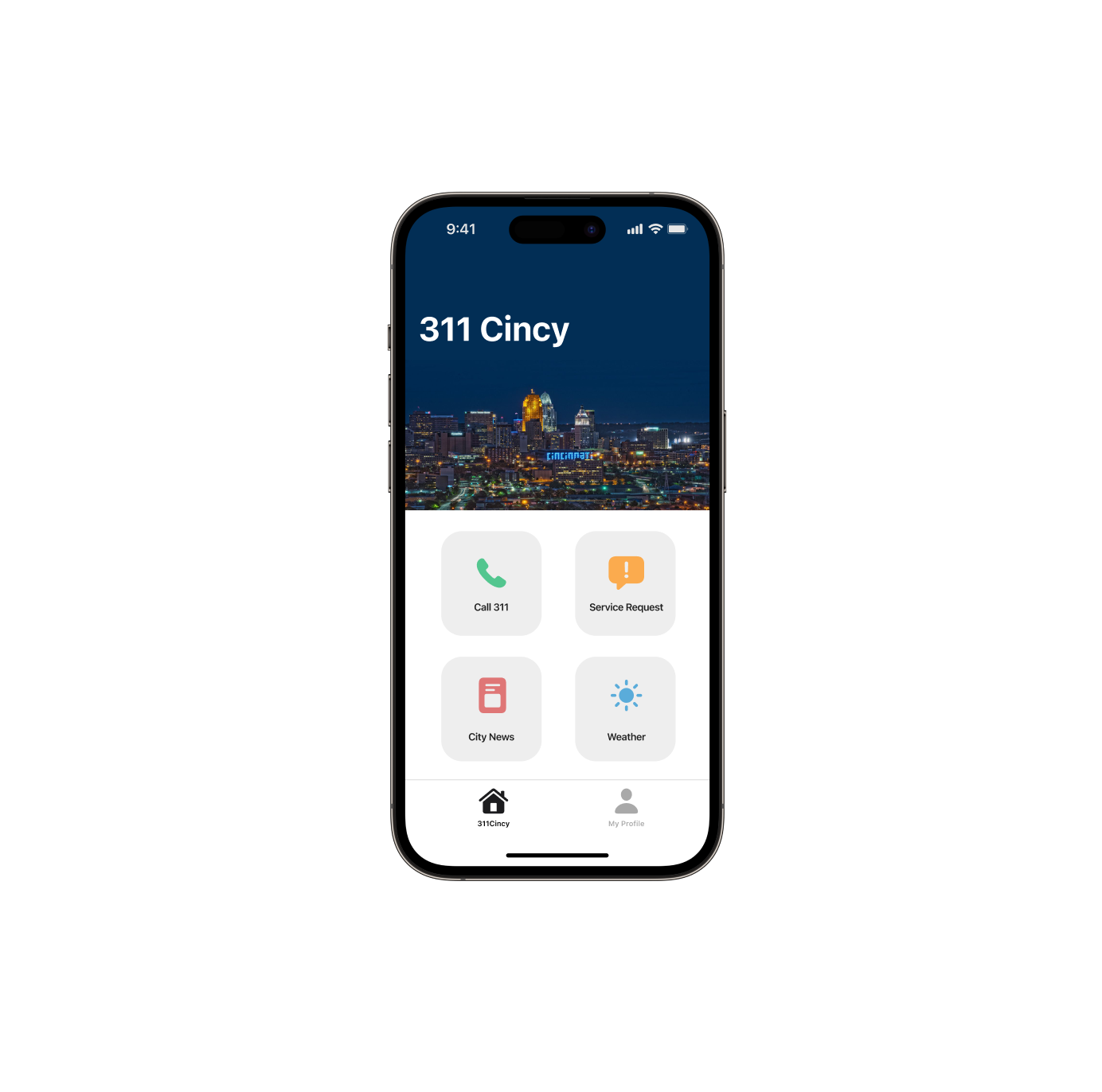
Draw the Drafts
I fully used the Figma to draw the draft and prototype. I created the wireframes based on the latest iOS device which is iPhone 14 Pro to draw three main screens for the new 311Cincy app. Then, I proceeded to make an interactive prototype that allows test users to do several clicks to make it more realistic.

Design Prototype


New 311Cincy app Demo Video
Usability Test
Our Goals
The goals are to bring a simple interface and easy-to-use experience for Cincinnati residents who need to learn their city news and do the requests in easy taps. We need to provide similar design languages to the website and combine the great features of smartphones. It should be easy to check alerts and request regular and emergent services with minimal taps.
Metrics of Success
Top Metrics
How long when they request a single service
User satisfaction ratings on the news section
Usage Time When Reques a Service (General Accessibility Request)

User Satisfaction Ratings on the News Section

Sub Metrics
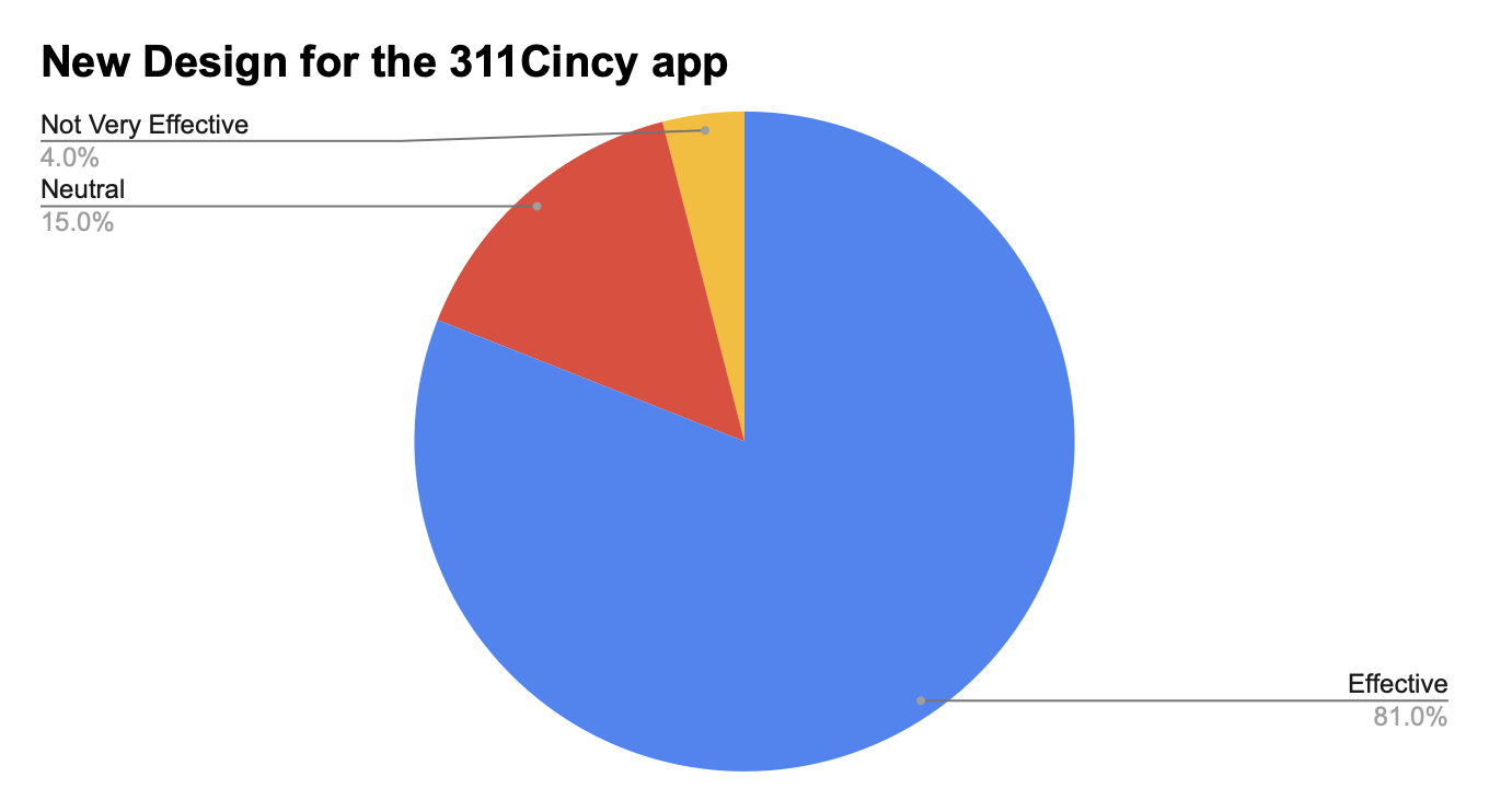
Effectiveness of the new app VS the old app
Effectiveness of the new app VS the current website

Quotes from Testers
Dallas (25), “The all-new design 311Cincy app makes a huge difference to the old app design which is easier to request services, check the city information, and view the specific service request progress. It let me want to keep installed on my phone forever!“
Teddy (52), “This is not an actual 311Cincy! I used the old app before, and it took me a long time to request a trash service. The call feature also reduced my time to find their number. I absolutely gonna fall in love with this new design.“
Conclusion
The 311Cincy Redesigned project brought me lots of great opportunities and challenges for me to learn the regular user experience design process and obtain new knowledge from the entire semester. Starting at the beginning of conducting research, it unveils what are new possibilities for me to discover one of the current services still needs to improve and update. I created user journey maps to see from a user perspective to think about how we should design an interface and workflow that works for everyone. Then the weak part for me in this project should be the analysis which means sometimes I could not really do a specific and polished comparison between two different platforms. I analyze the service’s current website and application to learn what parts are advantageous for them and the parts that need improvements. The most important and exciting part for me is the design prototypes which I really enjoyed demonstrating what the app should look like in a better design. In the final section which is the usability testing, I scheduled four participants aged from 20 to 60. The usability test plan construction part is identical which could help me to better understand and organize the actual purposes to learn from the users’ feedback and their satisfaction. Recruiting participants before the test is also a little hard for me because not everyone wants to share their experience with you. I figured it out when I posted the information on my Instagram and my friends or strangers who live in the Cincinnati Area can see this post to give me a comment. After I conducted interviews with some of the participants, the data visualization part was really interesting to see how we can make the boring data more lively. The whole journey for this project is really fun and unforgettable and it is also a great plus action for me as a UX Designer who worked on a “real” project before my career.